Abstraction, figuration and conceptual art meet in exhibitions at Salem College
By Tom Patterson Special Correspondent
Winston-Salem Journal
By Tom Patterson Special Correspondent
Winston-Salem Journal
The current exhibitions in Salem College’s Elberson Fine Arts Center serve as object lessons in abstraction, figuration and conceptual art. The works on view exemplify some of the myriad options available to artists working in any of these three modes.
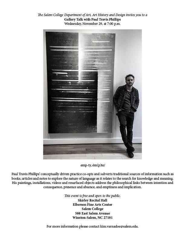
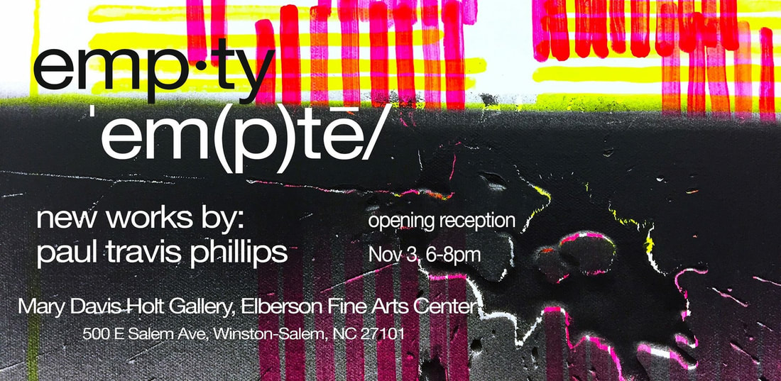
In the main exhibition space known as the Mary Davis Holt Gallery, paintings and mixed-media pieces by Paul Travis Phillips make up a show whose title phonetically subdivides the word “empty.” That’s “emp·ty, ˈem(p)tē/.”
Phillips earned a master’s degree in conceptual studio art last year at UNC-Chapel Hill, and he currently teaches art at Rowan Cabarrus Community College in Salisbury. His 41 works on view are from four different series that reflect on the mind’s appetite for knowledge and insight, as he explains in an accompanying statement. These works relate to minimalism and geometric abstraction, but they’re rooted in conceptual art. They’re about philosophy and the limits of language, both written and spoken, although that’s not so readily apparent.
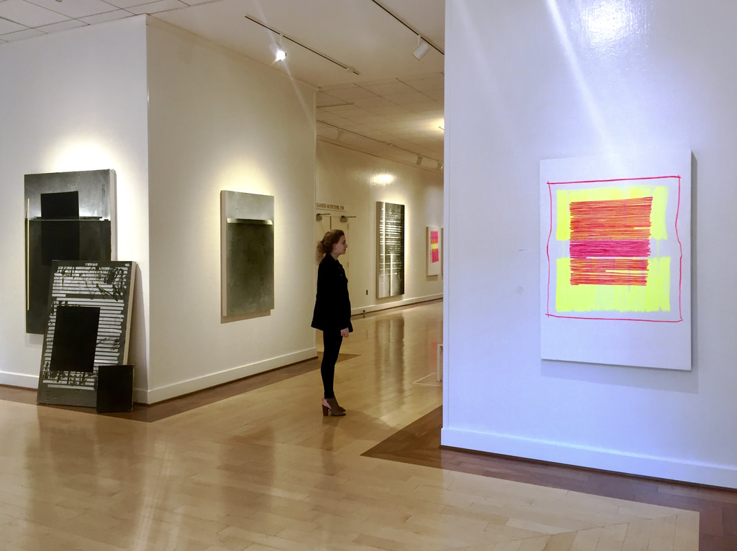
One of the show’s first features that viewers are likely to notice is the contrast between the more monochromatic, predominantly black and white pieces and those featuring bold shades of yellow and pink. The latter are from Phillips “highlighter” series, named for the ink markers typically used to highlight passages of text in a book or other printed document. Phillips employs these markers for purposes that might appear strictly visual, setting off densely spaced, free-handed lines of the contrasting colors against each other on mid-sized canvases. This strategy visually emphasizes the relationships of two neon-bright colors that cross and coincide within the same composition. Phillips’ theoretical statements about these works are posted on his website (www.paultravisphillips.com). Casual viewers who neglect to read them might perceive in these works a superficial relationship to op art, with its patterns of contrasting fluorescent colors. This segment of his audience is almost certain to overlook his stated intention of illuminating “the structural format of the text itself,” precisely because there are no texts in these works — at least not in the conventionally understood form of printed language. And yet, ironically, some verbal information is crucial to understanding his thematic intentions. It’s a conundrum that Phillips surely appreciates and perhaps enjoys.
Also included in the “highlighter” series are two small, freestanding canvases that flout conventional presentation. Instead of being wall-mounted they rest upended inside masking-taped squares on the wooden floor. The one that’s painted bright pink on its front-facing surface is titled “surface.” The white front surface of the other one, titled “frame,” has been left unpainted, while its reverse side with the exposed wooden stretcher bars is painted pink and yellow.
Most of Phillips’ black and white pieces are from his “studio notes” series, which references — and in some cases exemplifies — his use of masking tape in his art practice. Again, an understanding of these works requires familiarity with what he has written about them. In this case, he writes, “the process of taping and re-taping sections of painting has become a seductive metaphor for the way my mind digests thoughts and questions,” and “has led me to more seriously consider the relationship between the ‘real’ and the ‘illusion’ in relation to the pursuit of knowledge.” And again, casual viewers who don’t read his theoretical commentary will surely miss this thematic nuance. Those determined to see pictorial imagery in any and every work of visual art might insist that these works depict mini-blinds, since a number of them feature stacks of horizontal white lines set off against coal-black grounds. More attentive viewers will see otherwise, even without reference to Phillips’ comments on the series. These viewers will also appreciate the fact that several works incorporate strips of real masking tape stuck to their surfaces, while a few others include precisely painted, realistic depictions of masking tape — subtle hints of an otherwise hidden talent for representational drawing.
Considering the reliance of Phillips’ work on written explanations, it’s somewhat surprising to discover that he considers reading “an arduous task,” as he writes on his website. “Words, specifically written words, are very slippery things,” he continues. “It is a time-consuming and exhausting task to get them to stay put long enough for me to grasp their structure and syntax, let alone their meaning in relation to each other.”
His expressed difficulty with reading is a reference point for the other two related series represented in his show. The “discarded” series consists of books he found and covered with graphite and charcoal. What remains of them are small black slabs that constantly shed black dust. To create the drawings in the fourth series, “impressions of a book,” he submerged the pages of discarded books into a solution of graphite and binder, then applied them to previously blank paper surfaces to create overlapping and intertwined lines. The results in both series are book-related works that defy conventional reading.
(The rest of this article can be viewed at Journal Now)